Layout Image

Author Archive for Scott Alberts

So You Think You Can Design Logos

Tuesday, February 1st, 2011

Images of the process our graphics designer, Scott Alberts took for The Rhythm Studio.

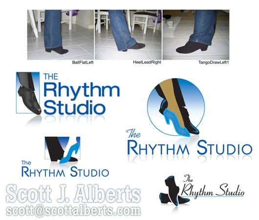
The logo design process for The Rhythm Studio in the Austin, TX area, was truly a learning experience. Tracy King Perry was looking for a way to communicate multiple forms of dance in a single image. Early sketches of ballroom-style dance images were discarded because Tracy’s focus was to be different from all of the other social / ballroom dance studios out there.

She DID NOT want a graphic of a couple dancing together.  From that distinction, we moved on to body parts, poses, and finally to feet.

A good thing to consider in the branding process. Are we limiting our messages to a specific:

  • gender,
  • age group, or
  • lifestyle?

The Rhythm Studio message is that dance is FUN and for EVERYONE. So, two feet: a couple. Three feet: awkward! Four feet: too symmetrical (trust me). Five feet: everyone’s dancin’!

And as a professional Instructor, Tracy wanted accuracy and credibility in the images. So she started sending me pictures of her feet! In fact, some time later when we connected on LinkedIn, I was surprised to see her face for the first time (my mental image of her was a pair of shoes!). Starting with zero knowledge of the subject, I was suddenly sketching all sorts of dance steps and their corresponding shoe styles. Tracy sent me all sorts of shoe photos and even YouTube links to dance moves, so I would be able to place the feet at the correct balance and contact with the floor.

The final logo considerations for The Rhythm Studio.As we experimented with “one of each” dance style and shoe, we realized that the individual dancing shoes could also appear separately in marketing materials. How’s that for value? Five logos in one, and we can even alternate the images on her home page so they dance!

The extra mile has been worth it; not only has she been thrilled with the logo design, but Tracy and I have been developing additional logos and marketing pieces for her Early Childhood and Youth classes over the past year.

More about Scott Alberts

Read more posts from Scott:

Making Their Mark

The Customer Is Right

Comments (0)
Categories : Designing Logos

Making Their Mark

Monday, January 25th, 2010

When I was first contracted to create a logo design for Via-Cell, their idea was a genie, possibly emerging from a lamp, holding coffee, food, and other goodies that can be ordered “via” their “cell-” phone and web-based system. I went to work sketching what I hoped would become the next Chester Cheetah, Tony Tiger or Michelin Man.

Via-Cell LogoUnfortunately, a lot of the logo design process consists of sketching out what DOESN’T work. In this case, the primary use of the Via-Cell mark would be tiny, used on app button-sized and even smaller icons, including bookmark icons and buttons within their own application.  We had to whittle away the details and – despite my Illustration-loving ways – to arrive at a simple, recognizable Icon that would still embody their brand: a Magic Lamp that brings your wishes with a touch. (Their marketing tag-line at the start was even, “Your Mobile Bazaar.”)

Their web site went online recently, and they hope to expand rapidly beyond their Woodside, CA neighborhood. The system utilizes no special software or dedicated equipment and works entirely through the internet.

A recent article in Website Magazine cautions e-commerce entrepreneurs: “Keep Your Graphic Designer on a Short Leash.” Ouch! It wasn’t a case of reigning in their renegade Artist, it was an experience we shared as we zeroed in on the brand and its end-use. Note that the Via-Cell Site is also designed to communicate the process at a glance, without reliance on text or even English-language proficiency). Point-of-sales pieces for merchant use are being developed with the same quick, visual message.

Stages Of Logo Development

Stages Of Logo Development

Well, at least Via-Cell has plenty of  ideas ready at hand should they decide to develop a Mascot or “The Animated Series.”  K.I.S.S.: Keep It Simple, Scott!

If you’re interested in more articles like the one referenced above, consider signing up for your own copy at Website Magazine, and see what industry professionals are talking about.

The Customer is Right

Thursday, March 19th, 2009

homethingslogoThe customer may not be infallible (like you or I?), but it’s a safe bet they know a lot more about their own business than I do. It’s my job to help them realize their vision, not mine. We’re building their brand, not my portfolio. As competition gets more fierce (or if you will, as marketing dollars get more scarce), even established ad agencies are acknowledging that customers must have the final “say” in their own brand.

Too many of my business customers have told me how they do not like their logo or their web site, and by extension the letterhead, cards, and all the matching materials … but they’ve already spent THAT part of their budget. (If only I had a dollar — okay, the long-gone thousand dollars — for every time I heard that!)

It has been a running joke between Home Things! owner Andrea Hogan and I, that I just didn’t “get” the logo that we created. But she loves it, her customers love it, and for some reason women in general — her target market — loves it. Why should I argue? A satisfied, loyal customer is a wonderful thing!

A very interesting discussion, “Ode to the amateur logo” is still underway at Before & After. Check it out for a revealing insight into both the designer’s and the customer’s perspective.

View additional logos designed by Scott Alberts.

Winged Monkeys by Scott Alberts at Appleton’s PAC

Saturday, March 14th, 2009

I love my job! I was commissioned to create 11 large-scale illustrations featuring Winged Monkeys for the Performing Arts Center’s “Wonderfully Wicked” Gala on Feb. 6, 2009. The Wizard of Oz-themed musical “Wicked” ran in Appleton, Wisconsin through Feb. 28th. Steve Quinn, the Tour’s Company Manager, actually asked to meet the Artist, and later offered this generous endorsement:

“Scott – After three years on the road of attending Wicked themed parties across the country, nothing quite caught my eye like your flying monkey pieces did at the Appleton gala of Wicked.  The images captured a nice playfulness about our show, and immediately struck my eye as being reminiscent of some of the characters Maurice Sendak created in “Where the Wild Things Are.”  Our entire company loved them!  Keep up the good work!” – Steve Quinn, Company Manager, Wicked Tour

While the displays were only up for the single-evening event, much like the Lion statues from 2007′s Lion King events, the Monkeys are being “adopted” by businesses and institutions around Appleton. Most of the pieces are 8 feet wide or larger, created at “normal” size (18-inches wide) and printed to canvas banners at Exhibit Resource of De Pere.

It was a privilege and a great opportunity to be included in the project along with some of the best artists in the area.

- Scott Alberts

This post was originally published on Scott Albert’s Freelance Artist blog with a follow-up post “Wicked” continued: The Two Glindas