Layout Image

Archive for Designing Logos

Use Vendor and Client Logos

Monday, November 7th, 2011

This is the wrong time of year to ignore customer anxieties. People subconsciously assess your site in 1/20th of a second, so your first impression should be the very best possible.

Let your visitor know how you’ll be shipping and let them see who you work with. Those logos help build credibility, and also build trust. Use them prominently on the first page, don’t hide them!

Trophy.Additionally important are any awards, certifications, testimonials, and guarantees. Images are important, and make a statement about your company using less text and valuable real estate. Images are said to be worth 400-500 words, so if you have a badge or image for awards, certifications and guarantees, use those images instead of naming the award.

Have you signed up for Build a Better Website yet?

You don’t expect to marry on a first date. Convincing another that you’re there for the long road ahead isn’t that fast, either. Learn the basics, sign up for our Build a Better Website course to understand what it really takes to set the foundation for long-term customer relationship building online.

This week’s audio is titled “Your Website Might Have Trust Issues.” I think you’ll enjoy it, leave me a comment and let me know!

Comments (0)

Making Their Mark

Monday, January 25th, 2010

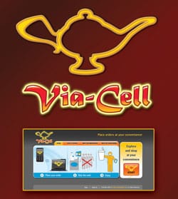
When I was first contracted to create a logo design for Via-Cell, their idea was a genie, possibly emerging from a lamp, holding coffee, food, and other goodies that can be ordered “via” their “cell-” phone and web-based system. I went to work sketching what I hoped would become the next Chester Cheetah, Tony Tiger or Michelin Man.

Via-Cell LogoUnfortunately, a lot of the logo design process consists of sketching out what DOESN’T work. In this case, the primary use of the Via-Cell mark would be tiny, used on app button-sized and even smaller icons, including bookmark icons and buttons within their own application.  We had to whittle away the details and – despite my Illustration-loving ways – to arrive at a simple, recognizable Icon that would still embody their brand: a Magic Lamp that brings your wishes with a touch. (Their marketing tag-line at the start was even, “Your Mobile Bazaar.”)

Their web site went online recently, and they hope to expand rapidly beyond their Woodside, CA neighborhood. The system utilizes no special software or dedicated equipment and works entirely through the internet.

A recent article in Website Magazine cautions e-commerce entrepreneurs: “Keep Your Graphic Designer on a Short Leash.” Ouch! It wasn’t a case of reigning in their renegade Artist, it was an experience we shared as we zeroed in on the brand and its end-use. Note that the Via-Cell Site is also designed to communicate the process at a glance, without reliance on text or even English-language proficiency). Point-of-sales pieces for merchant use are being developed with the same quick, visual message.

Stages Of Logo Development

Stages Of Logo Development

Well, at least Via-Cell has plenty of  ideas ready at hand should they decide to develop a Mascot or “The Animated Series.”  K.I.S.S.: Keep It Simple, Scott!

If you’re interested in more articles like the one referenced above, consider signing up for your own copy at Website Magazine, and see what industry professionals are talking about.

You can make your own business cards. There. I said it. It CAN be done. They can be made using most programs already on your computer and they can be printed out using perforated card paper right from your printer for a very small amount of money.

In years past, the older perforated card stock looked perforated. You could see the little bumps along the side. The new micro-perf stuff is better, but the stock is too lightweight and results in a flimsy card, but worse than that, you can actually damage your printer using the heavier card stocks.  You want an eye-catching card that has a professional weight to it. The type of printing matters also. A home printed card on an inkjet printer will bleed if it comes in contact with moisture, a dead giveaway. Digital printing, on the other hand, offers good color options which allow a professional to really give it pizzazz!

Brand new baby businesses may print off a handful of cards in a pinch while they wait for the printer, it’s not the end of the world. People usually take this route to save money, but a small run of cards printed digitally at a print shop can be quite affordable. Most print shops let you download right from your computer and then they run them and cut them for you. All you do is pick them up!

Most people who design their own cards want to use clip art, but clip art straight out of the box shouts, “amateur!” While these methods are inexpensive, you never want to appear cheap.

What DOES It Mean To Design Business Cards?

Example of professional design for business cardsMany things factor into a great business card, and design is definitely one of them. Your content is important, of course, but what does that card say about your ability to do what it is you do? Your card may be the first anyone’s heard of you.

7 Characteristics of Great Business Card Design

  • Color selection
  • Logo placement
  • Contact placement
  • Tag line
  • What gets placed on the front of the card, and
  • What gets placed on the back, if anything
  • Overall message, overall appearance

Design business cards with logo placement in mindYour logo placement is important to the design elements of your business cards. Our Graphic Designer, Scott Alberts, includes the price of business card design in his logo design rate because when he doesn’t, customers attempt to place his professionally designed logo onto a business card and the transfer is a very poor rendition of his ability. He would rather include business card design and preserve his excellent reputation! His cards are set up with the printer in mind, so many times “prep” or “plate charges” can be avoided.

Concerning contact placement and tag line, what you do has a lot to do with where you decide to place your information. Does your contact need to be the first thing seen? Or your message? Where exactly is that? If you don’t want to have that all thought out for you, try this little exercise:

Take a card out and role play, handing the card to a neighbor and mimic a real life situation.  Where do their eyes go first? Where do they linger? What information do they ask for that already exists on your card?

A professional design takes into consideration what goes on to the front of your business card, and what goes on the back. Your overall message and presentation should be short, sweet, and sticky. The right business card design is your handshake, and a reference to your business possibly for years to come. Check out our Small Business Accelerator Packages for package pricing that is affordable, and still very professional. Our logo and business card design packages begin with our Kick Starter Package and grow from there. Our a la carte options are listed on our services page, and you can learn more about Scott Alberts Illustration And Design on our Meet The Team page.  Call us today for your personal, professional design!

Comments (6)

The Customer is Right

Thursday, March 19th, 2009

homethingslogoThe customer may not be infallible (like you or I?), but it’s a safe bet they know a lot more about their own business than I do. It’s my job to help them realize their vision, not mine. We’re building their brand, not my portfolio. As competition gets more fierce (or if you will, as marketing dollars get more scarce), even established ad agencies are acknowledging that customers must have the final “say” in their own brand.

Too many of my business customers have told me how they do not like their logo or their web site, and by extension the letterhead, cards, and all the matching materials … but they’ve already spent THAT part of their budget. (If only I had a dollar — okay, the long-gone thousand dollars — for every time I heard that!)

It has been a running joke between Home Things! owner Andrea Hogan and I, that I just didn’t “get” the logo that we created. But she loves it, her customers love it, and for some reason women in general — her target market — loves it. Why should I argue? A satisfied, loyal customer is a wonderful thing!

A very interesting discussion, “Ode to the amateur logo” is still underway at Before & After. Check it out for a revealing insight into both the designer’s and the customer’s perspective.

View additional logos designed by Scott Alberts.