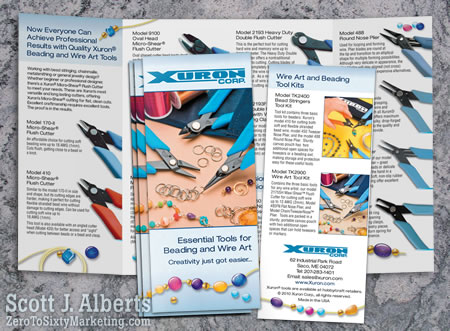
 The simple answer is, “No.” Still, you’ll get conflicting opinions when it comes to how you should be reading a barrel roll trifold brochure. Accordion-fold brochures are much easier to figure out, but when faced with two panels at the same time, like the barrel-fold allows, you’re left wondering what the brochure creator’s intention was. The first two panels are a no-brainer, right? Front cover, inside front cover … then what does a reader do? Open the flap to reveal the inside of the brochure to continue reading panels left to right? Or read inside the cover, then the folded flap, then the inside?
OH, brother …
When planning brochure designs, this is an important thing to consider. It can take far too much time to ponder when a deadline is hanging in the balance, so the thing to do when designing one is to decide how much of the information flows easily together on the two or three inside panels, depending on whether the business brochure is three or four panel. If you have enough information between images and text to populate the interior panels smoothly, then you can break down the rest as follows:
- Cover – Only one purpose, to entice the reader to pick it up and open it – that’s it. It should include color and image. I like text as well.
- Back center panel – 1/2 populated with text or image, 1/2 contact information including contact name, company name, phone, fax, email, and Website.
So what goes on the right side folded flap? Since it will be seen the minute the brochure is opened, it should introduce the subject matter. It might, however, be the last thing read, so it can also be an exit. I think it should either be compatible with the information on the inside cover or contrast entirely with it. In that way you’ll be able to direct your reader’s attention to where you intend it to go. A contrasting folded panel causes the reader to want to open it up to see the inside and come back to the folded panel later. If the text on that folded panel is a continuing thought or theme to the inside cover panel, it will be natural to read it before opening it up to reveal the inside.
Scott Alberts says Shari and I are both wrong to refer to them as a three or four panel brochures, when they really have six to eight panels en totale …
We stand corrected Scott, thank you.
Is there a right or wrong way to read a brochure? Well, don’t read it upside down:p)
Your thoughts?

“Scott Alberts says Shari and I are both wrong to refer to them as a three or four panel brochures, when they really have six to eight panels en totale …”
So THAT’s why you’re pricing ’em so low!
It’s always helpful to fold a sheet of paper and plan out the panels in pencil. And though I’m not a writer, it’s also better to compose the text with that structure in mind, in sections but not exactly “chapters”. You just can’t expect that everyone is going to follow your page-turner like a can’t-put-it-down novel.
I think there can be a right and wrong way to read any form of advertising. It all depends on how well the presenter does it sending the correct and intended message to its readers.