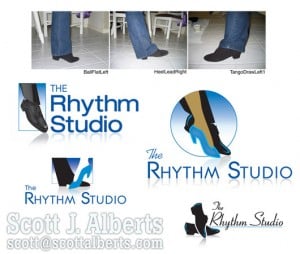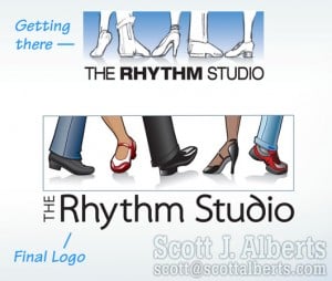
The logo design process for The Rhythm Studio in the Austin, TX area, was truly a learning experience.
Tracy King Perry was looking for a way to communicate multiple forms of dance in a single image.
Early sketches of ballroom-style dance images were discarded because Tracy’s focus was to be different from all of the other social / ballroom dance studios out there.
She DID NOT want a graphic of a couple dancing together. From that distinction, we moved on to body parts, poses, and finally to feet.
A good thing to consider in the branding process. Are we limiting our messages to a specific:
- gender,
- age group, or
- lifestyle?
The Rhythm Studio message is that dance is FUN and for EVERYONE. So, two feet: a couple. Three feet: awkward! Four feet: too symmetrical (trust me). Five feet: everyone’s dancin’!
And as a professional Instructor, Tracy wanted accuracy and credibility in the images. So she started sending me pictures of her feet! In fact, some time later when we connected on LinkedIn, I was surprised to see her face for the first time (my mental image of her was a pair of shoes!). Starting with zero knowledge of the subject, I was suddenly sketching all sorts of dance steps and their corresponding shoe styles. Tracy sent me all sorts of shoe photos and even YouTube links to dance moves, so I would be able to place the feet at the correct balance and contact with the floor.
 As we experimented with “one of each” dance style and shoe, we realized that the individual dancing shoes could also appear separately in marketing materials. How’s that for value? Five logos in one, and we can even alternate the images on her home page so they dance!
The extra mile has been worth it; not only has she been thrilled with the logo design, but Tracy and I have been developing additional logos and marketing pieces for her Early Childhood and Youth classes over the past year.
More about Scott Alberts
Read more posts from Scott:

Leave a Reply